17 Room Color Schemes to Transform Your Home in 2026
Color is the fastest, cheapest way to change how a home feels — faster than new furniture, cheaper than a renovation. And in 2026, the color story has shifted decisively: cool grays are out, warmth is in. Think sun-baked clays, deep botanical greens, creamy oatmeals, and jewel tones that glow under lamplight.
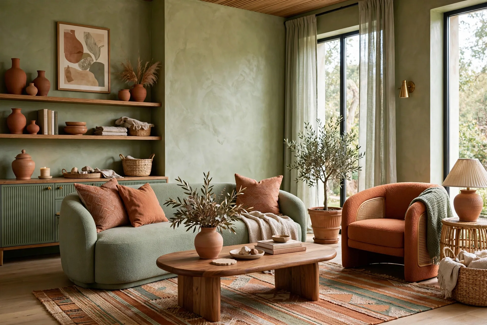
Below are 17 room color schemes built around combinations you won’t see in every catalog — each one practical, livable, and tuned to how real homes are actually used. Pick a room, pick a palette, and watch it transform. Color works hand in hand with light — see our modern ceiling decoration ideas for lighting tricks that make any palette shine.
How to Pick Colors That Actually Work
Three rules before you start. First, test paint in your own light — a color that looks creamy in the store can turn pink under your bulbs. Paint a large swatch and live with it for two days. Second, follow the 60-30-10 rule: 60% of the room in your main color, 30% in a supporting tone, 10% in an accent that pops. Third, think about flow — colors should feel like a conversation from room to room, not 17 separate arguments.
1. Oatmeal and Forest Green Hallway
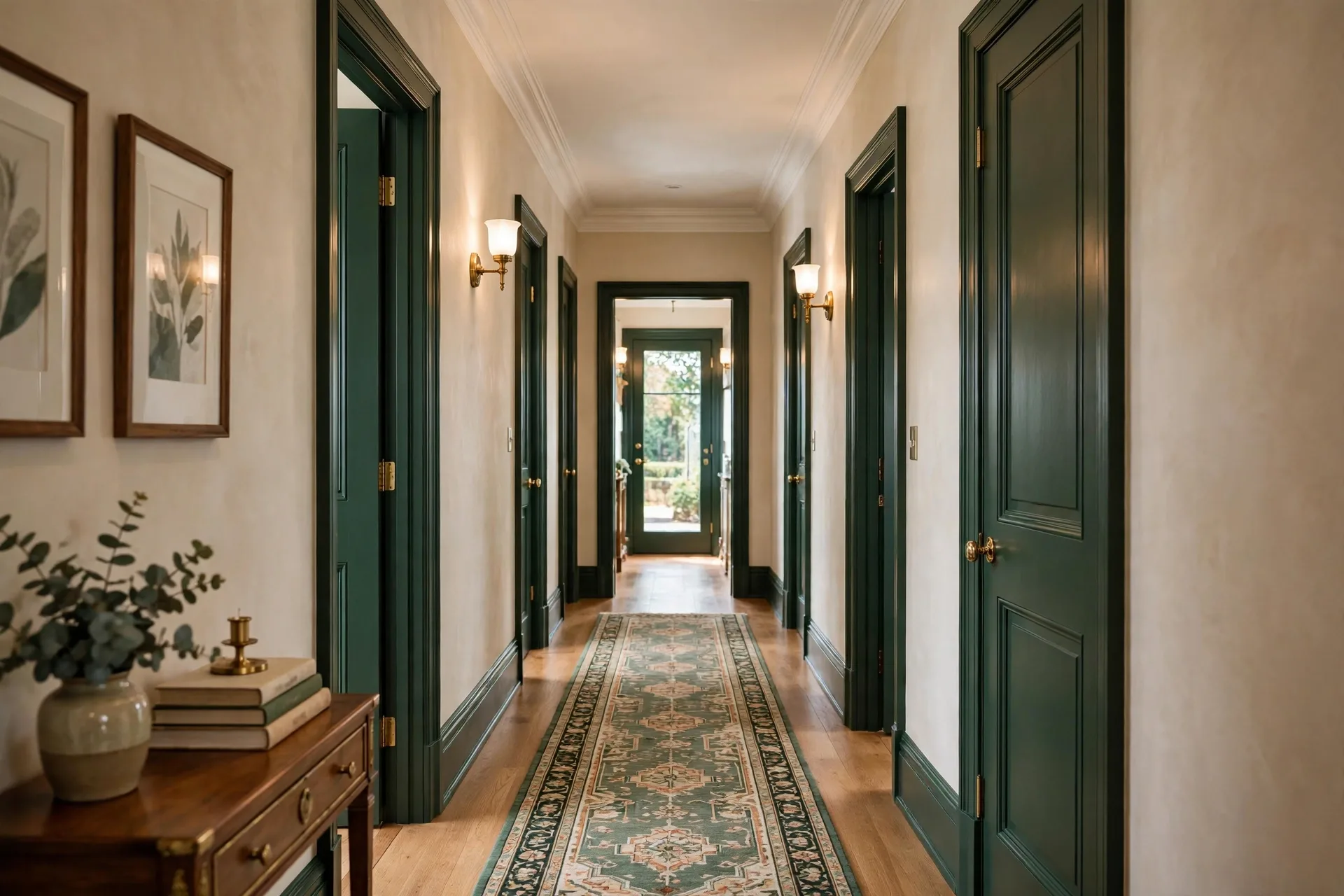
Hallways are the forgotten rooms, and they deserve better. Warm oatmeal walls with a deep forest green on the doors and trim turn a plain corridor into a gallery. The green frames every doorway like artwork. Make it work: add a runner rug with green in the pattern and simple brass hooks. Suddenly the hallway is the most designed space in the house.
2. Butter Yellow and White Cottage Kitchen
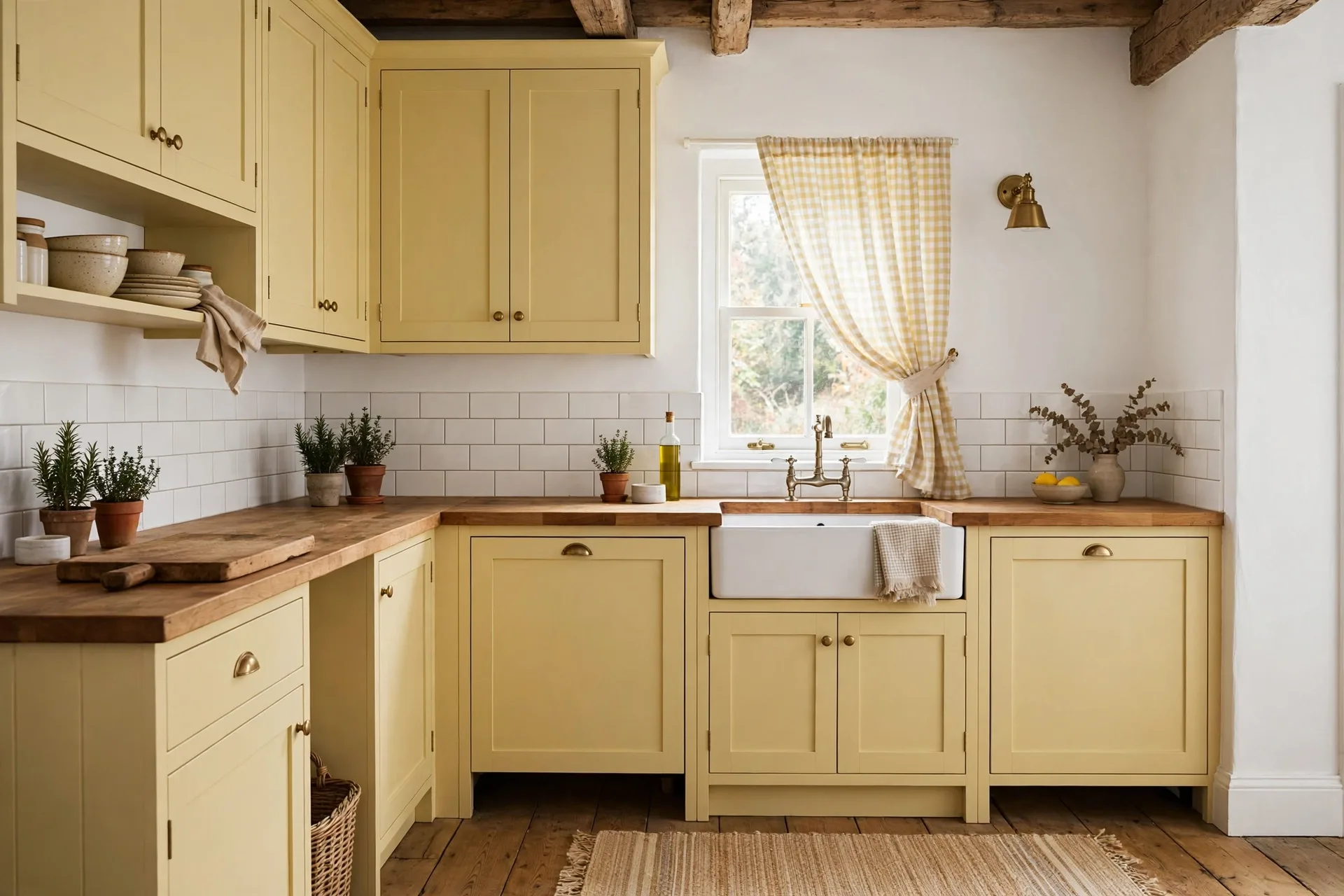
Forget stark white kitchens. Soft butter yellow on the cabinets with crisp white walls and butcher-block counters creates a kitchen that feels like morning all day. It’s cheerful without being loud, and it hides everyday mess far better than pure white. Make it work: keep hardware simple — matte black or aged brass — and let the yellow be the star. Open shelving in natural wood completes the cottage feel.
3. Clay and Linen Bedroom
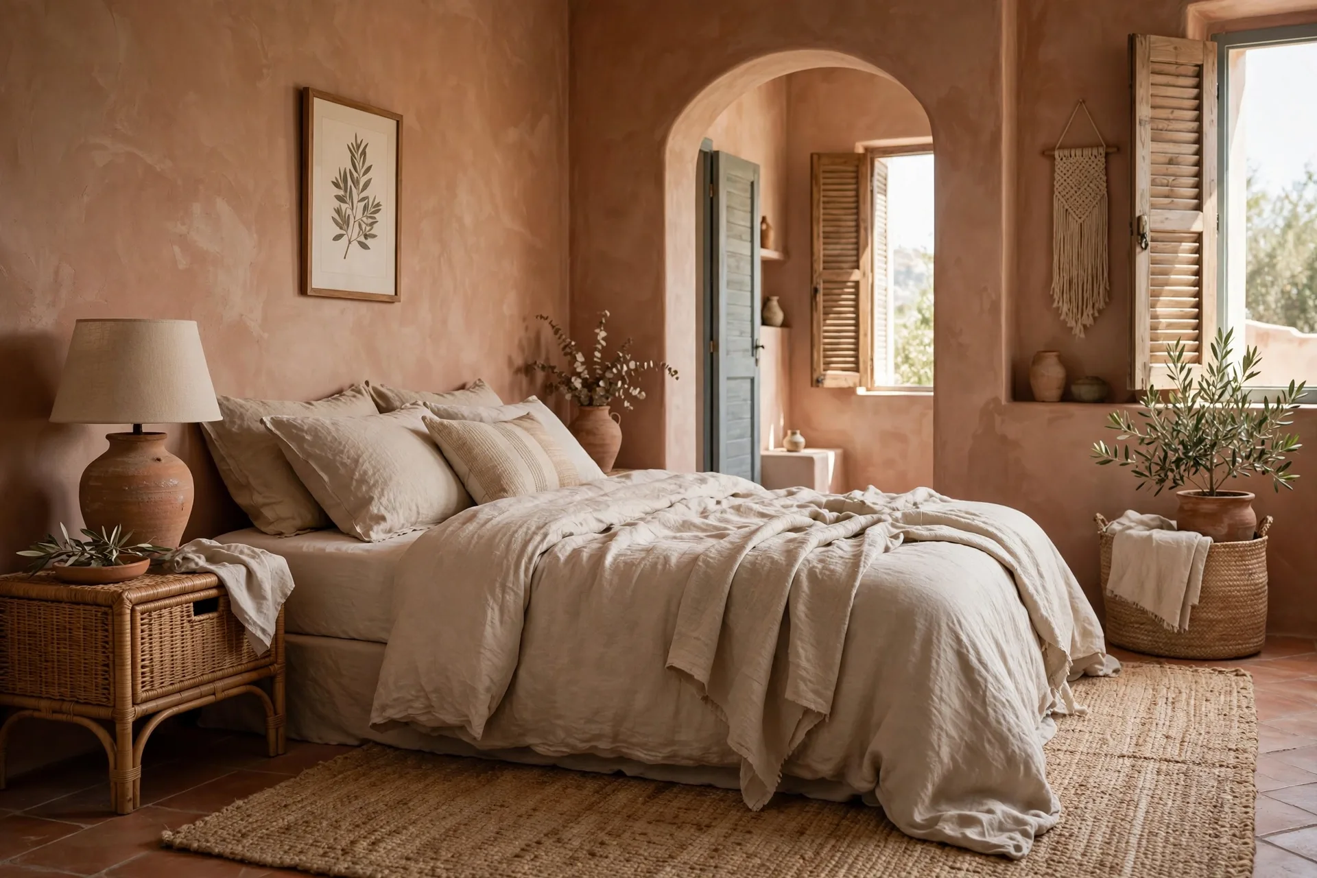
Sun-baked clay walls (think warm, muted terracotta-pink) paired with natural linen bedding create a bedroom that feels like a Mediterranean retreat. The color is warm enough to glow at night yet soft enough for restful sleep. Make it work: choose linen in undyed flax tones, add a jute rug, and keep wood furniture light. This scheme practically begs for a slow Sunday morning.
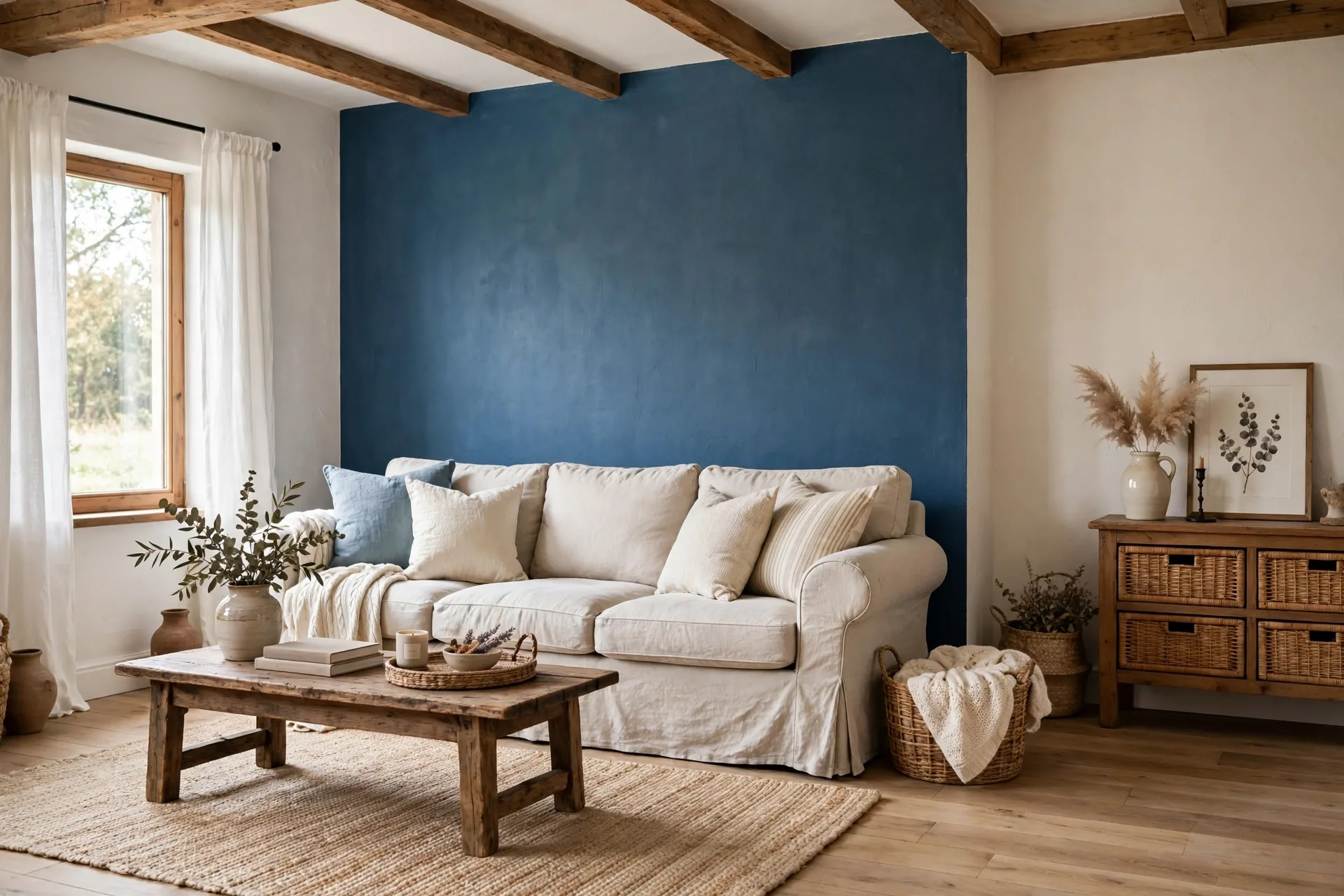
4. Denim Blue and Warm White Farmhouse Living Room
Denim blue — that faded, lived-in mid-blue — on a feature wall or in the upholstery, against warm white walls, gives you farmhouse charm without the clichés. It’s relaxed, honest, and endlessly combinable. Make it work: layer in natural textures — a sisal rug, linen slipcovers, raw wood beams or shelves. The blue deepens beautifully in evening lamplight.
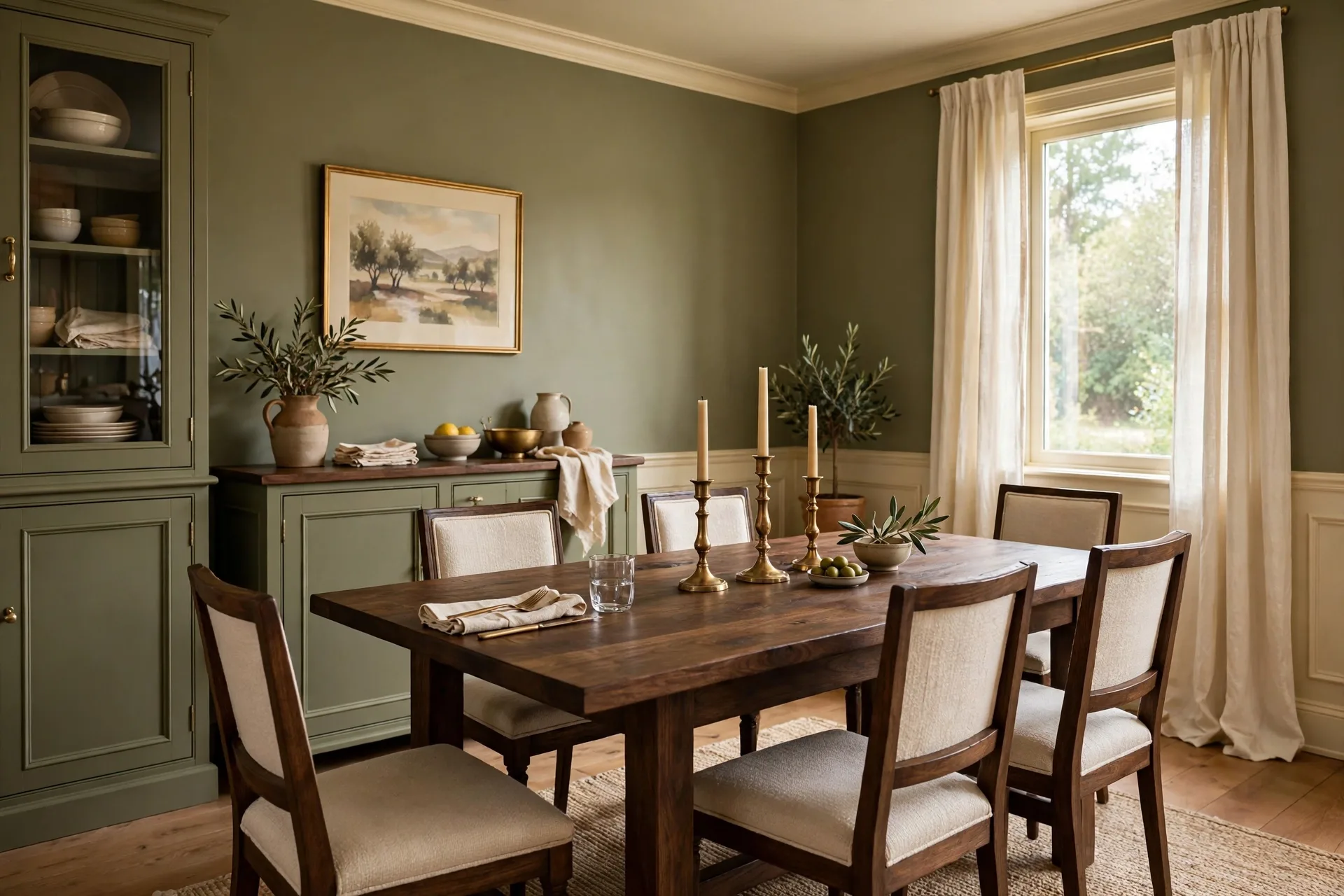
5. Olive and Cream Dining Room
Olive green walls with cream wainscoting or trim make dining rooms feel intimate and a little bit European. It’s a color that makes food look better and conversations last longer. Candlelight on olive walls is genuinely magical. Make it work: a dark wood table, cream linen napkins, and brass candlesticks. Keep the ceiling bright white so the room never feels heavy.
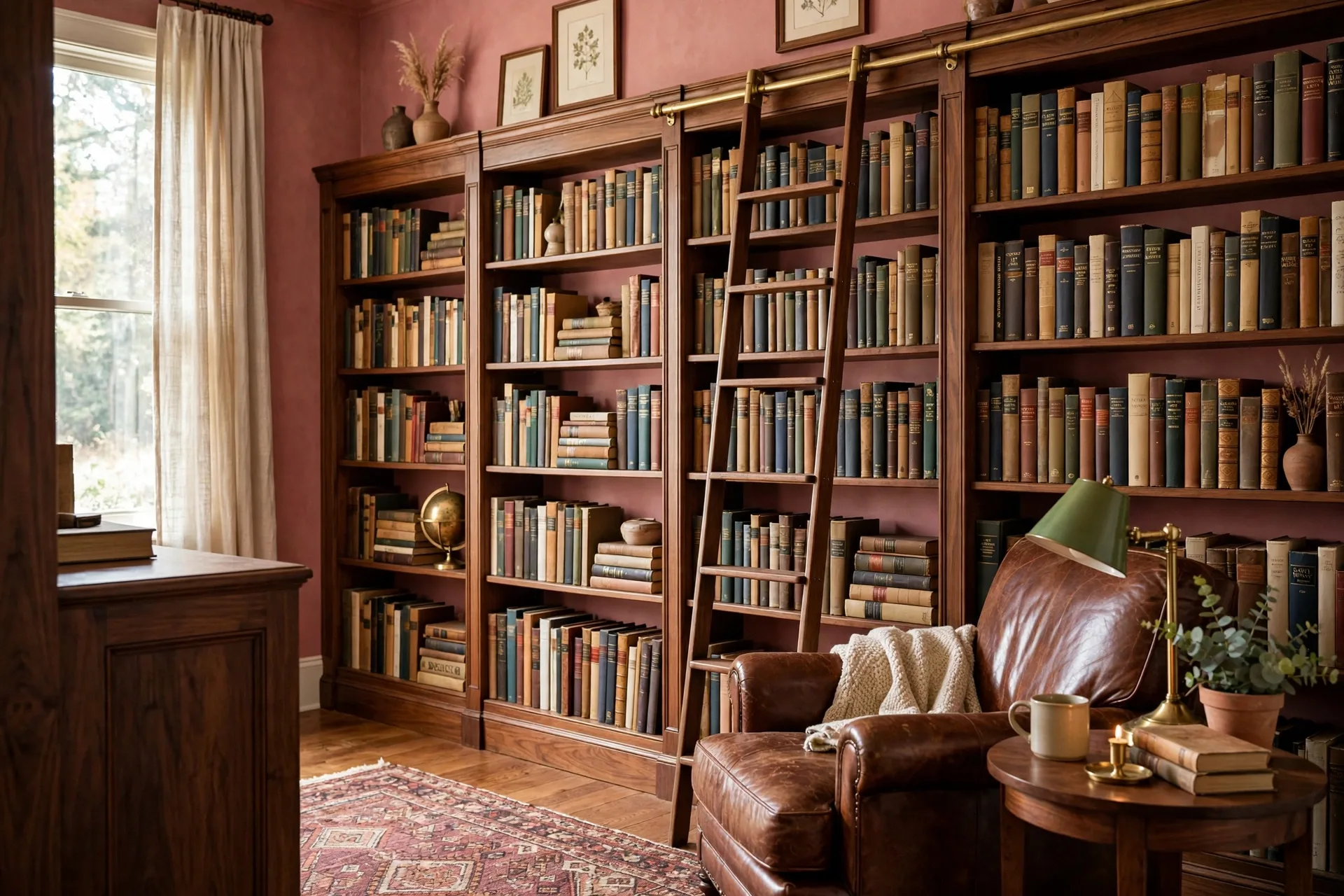
6. Dusty Rose and Walnut Home Library
For a reading room or study corner, dusty rose walls with rich walnut bookshelves strike the perfect balance — soft enough to relax in, serious enough to focus. The pink undertone flatters lamplight and makes the wood glow. Make it work: fill the shelves with actual books (spines out, no color-coding theatrics), add a leather armchair in cognac, and a floor lamp with a fabric shade. Pure 2026 coziness.
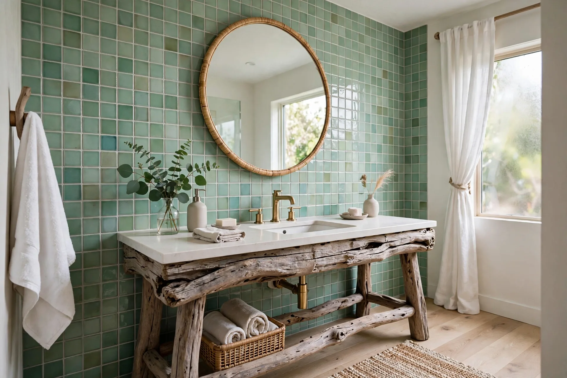
7. Sea Glass and Driftwood Bathroom
Pale sea-glass green tiles or walls with driftwood-toned vanity and accents turn a bathroom into a coastal spa — without a single seashell in sight. The green is calming, the wood keeps it warm, and white fixtures keep it clean. Make it work: brushed nickel or matte black fixtures, a round mirror, and one eucalyptus sprig in a vase. Small bathrooms especially benefit; the palette visually expands the space.
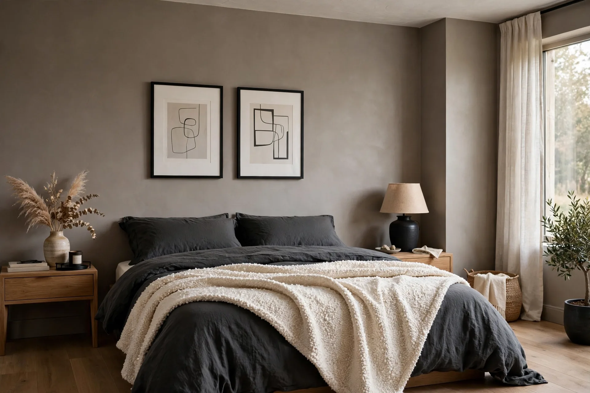
8. Mushroom and Charcoal Modern Bedroom
Warm mushroom-gray walls with charcoal bedding and black-framed art create a bedroom that’s modern but not cold. The mushroom undertone — that beige-gray middle ground — is 2026’s answer to boring gray. Make it work: add texture aggressively: a bouclé throw, linen duvet, wool rug. Texture is what keeps a neutral scheme from feeling flat, and this palette rewards every layer.
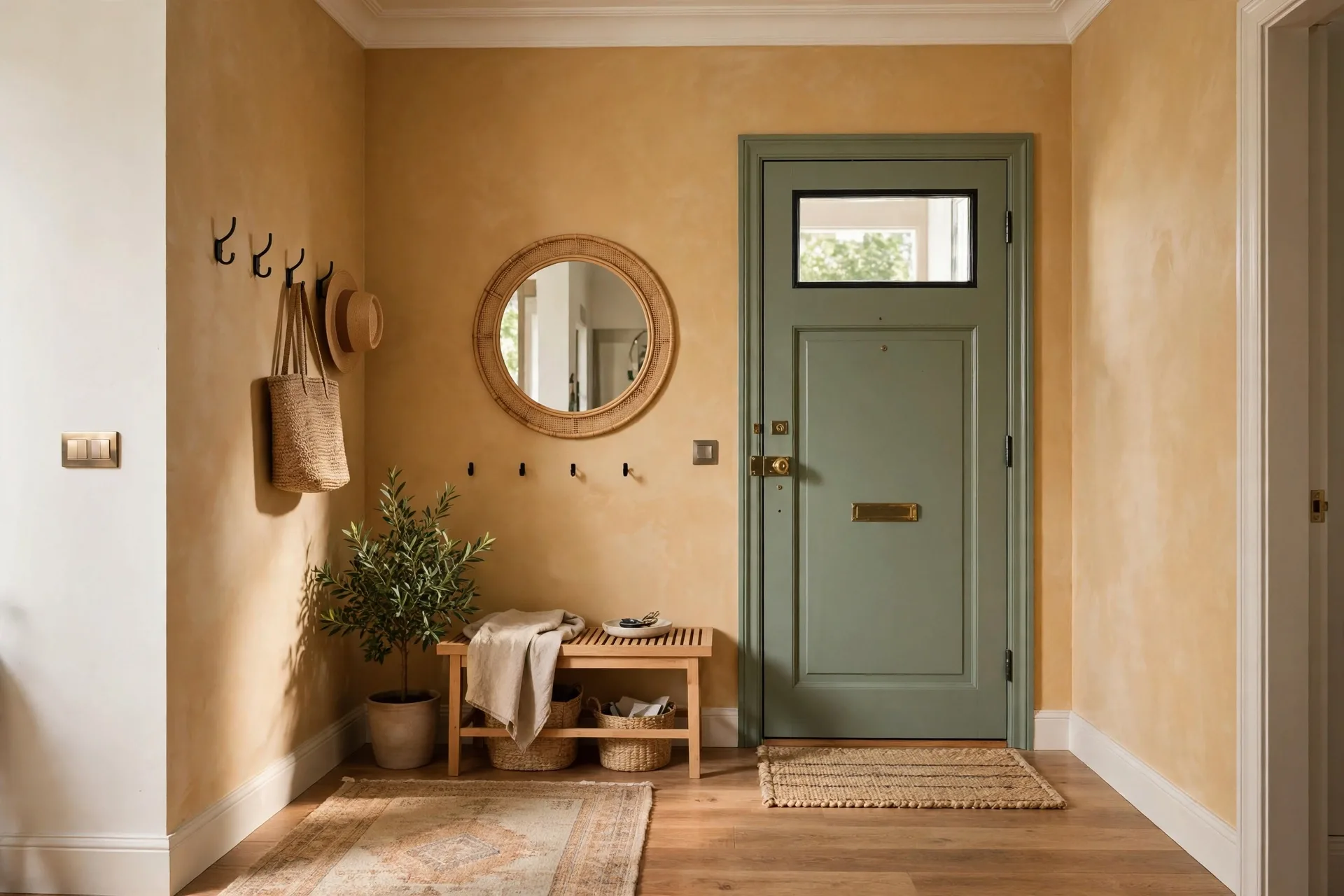
9. Honey and Sage Entryway
First impressions matter. Warm honey-toned walls (a golden, welcoming beige) with sage green on the front door or a console table make entries feel sunny even on gray days. It’s an optimistic palette that says “come in.” Make it work: a round mirror to bounce light, a small bench with a cushion, and a tray for keys. Keep it uncluttered — entryways work hardest when they’re simple.
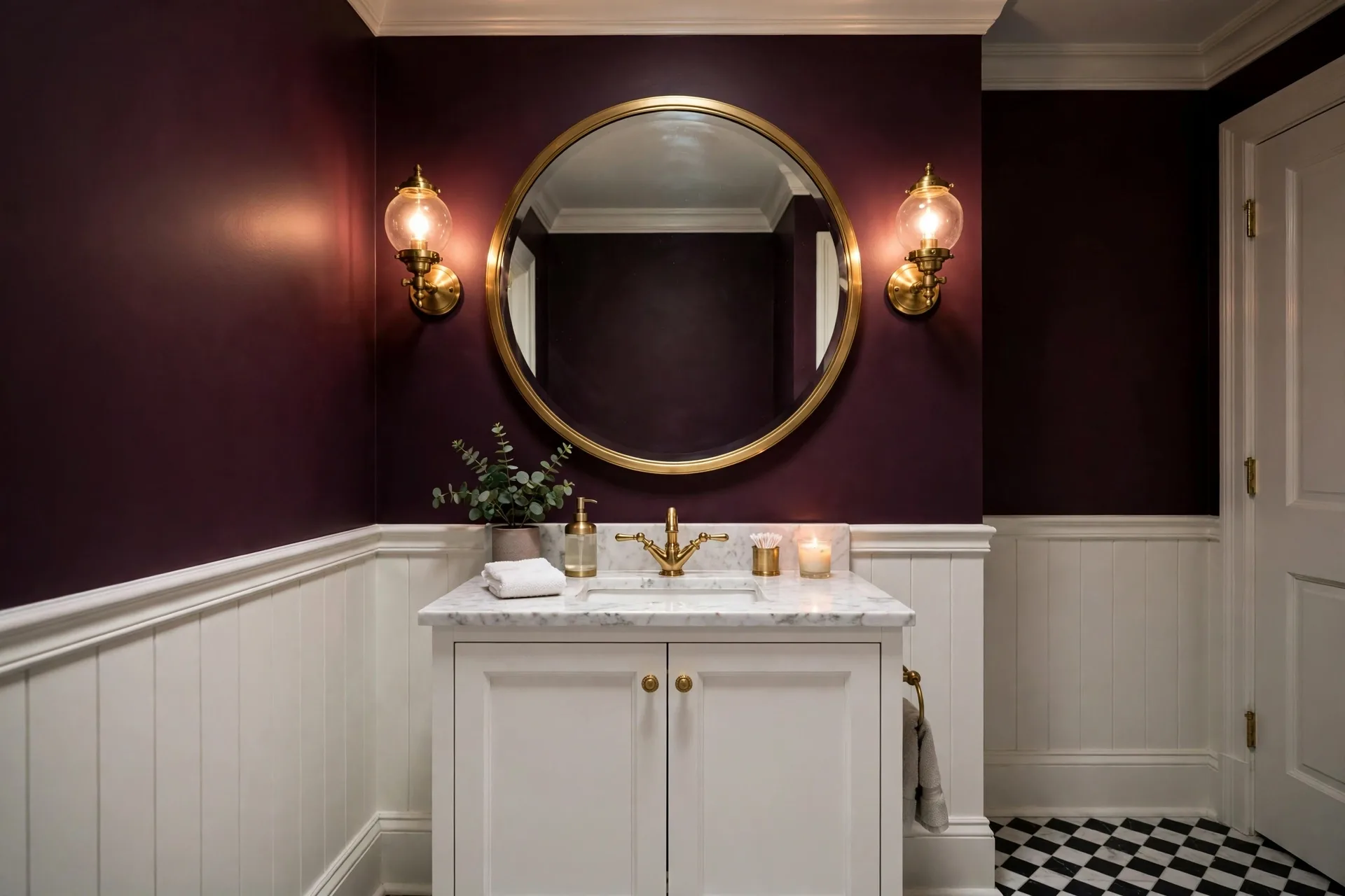
10. Plum and Brass Powder Room
Small powder rooms are where you can be bold. Deep plum walls with brass fixtures and a large mirror create a jewel-box effect that’s dramatic in the best way. Guests remember this room. Make it work: keep the vanity and toilet white for contrast, add one piece of art, and use warm bulbs. Plum absorbs light, so the mirror and metallics do the heavy lifting. Love a dark, moody palette? See our Halloween table decor ideas for 15 spooky yet elegant ways to use them.
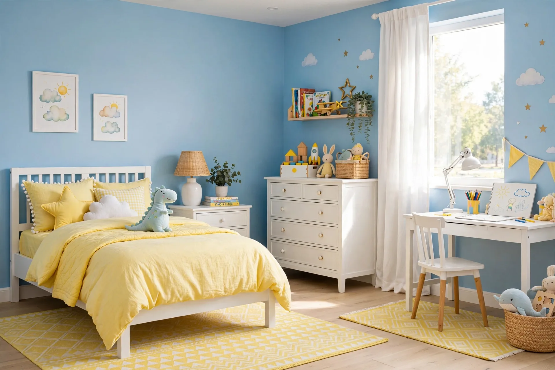
11. Sky Blue and Lemon Kids’ Room
Instead of the usual pink-or-blue binary, try sky blue walls with lemon yellow accents — bedding, a rug, toy storage. It’s fresh, gender-neutral, and grows with the child far better than themed decor. Make it work: keep furniture white and simple, let the colors live in textiles and accessories that are easy to swap. Add a chalkboard wall in a soft gray for creativity.
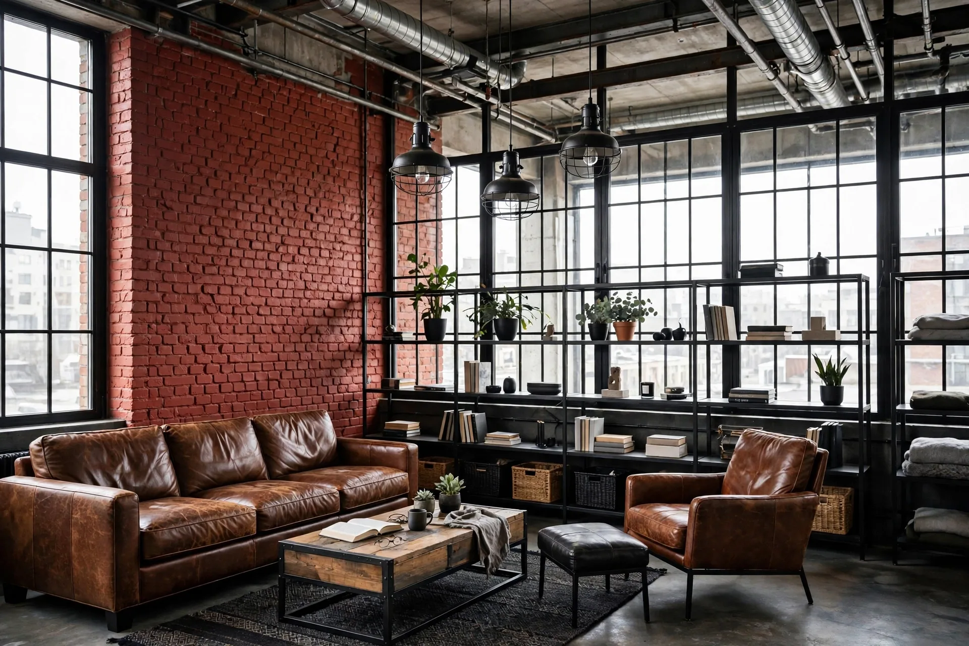
12. Brick Red and Black Industrial Loft
For lofts, studios, or anyone who loves edge: brick red on one wall (or exposed brick sealed with matte finish) with black window frames, shelving, and lighting. It’s urban, warm, and full of character. Make it work: balance with plenty of white or light wood elsewhere — the red is powerful and needs breathing room. Leather and metal accessories complete the industrial story.
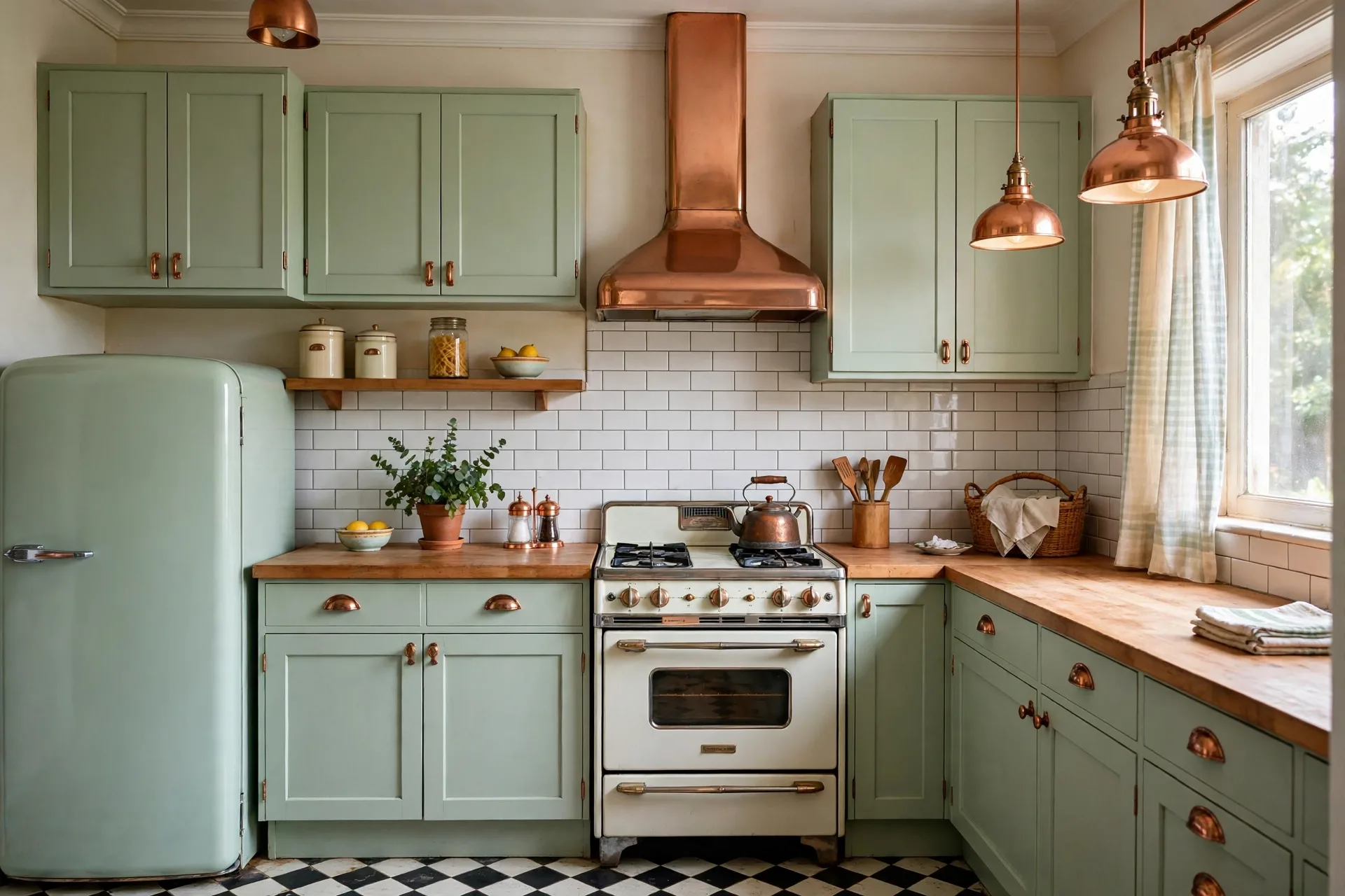
13. Mint and Copper Retro Kitchen
Soft mint green cabinets with copper hardware and open shelving channel mid-century charm without looking like a theme park. The mint is fresh, the copper adds warmth and a hint of luxury. Make it work: white subway tile backsplash, butcher block or white counters, and a few vintage-style appliances. This combination photographs beautifully and ages gracefully.
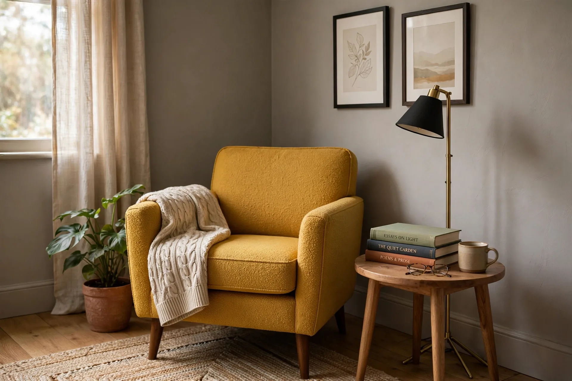
14. Warm Gray and Mustard Reading Corner
Even a corner deserves a scheme. Warm gray walls (gray with a yellow undertone, never blue) with mustard yellow in the armchair or throw create a nook that pulls you in. It’s the color equivalent of a good book. Make it work: a floor lamp with warm light is non-negotiable here, plus a small side table and a wool throw. Position near a window if you can — natural light makes mustard sing.
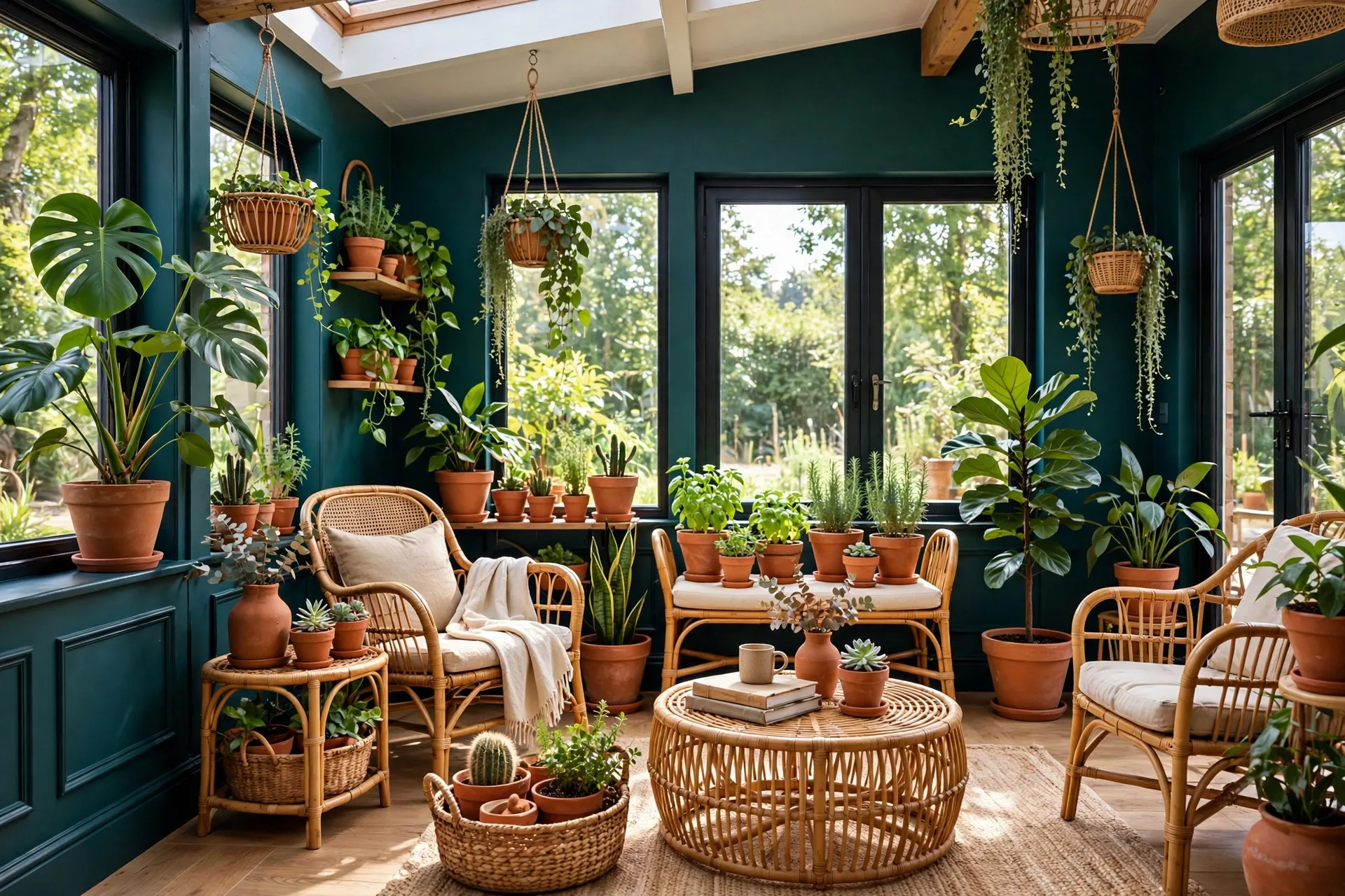
15. Teal and Terracotta Sunroom
For sunrooms, enclosed porches, or bright living areas: deep teal on the lower walls or in the furniture, with terracotta in pots, cushions, and textiles. It’s a botanical, traveled palette that thrives in natural light. Make it work: load up on plants — the green in the foliage bridges the teal and terracotta perfectly. Rattan or wicker furniture keeps it airy.
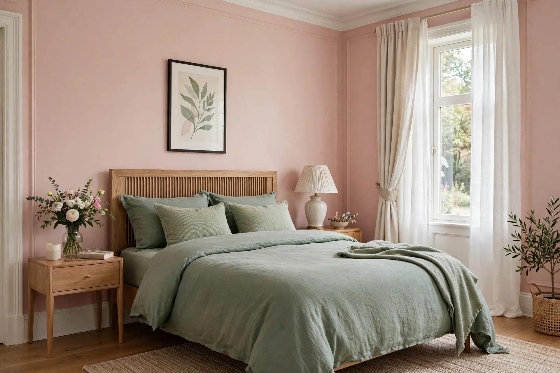
16. Blush and Sage Guest Bedroom
Guests deserve a scheme that feels like a boutique hotel. Blush pink walls (soft, never bubblegum) with sage green bedding and white trim create a room that’s welcoming, calm, and quietly luxurious. Make it work: hotel-style white sheets, a sage throw at the foot, a small vase of fresh flowers, and a carafe of water on the nightstand. Your guests will never want to leave. For a full room makeover in this style, our vintage grandma bedroom decor ideas pair beautifully with this palette.
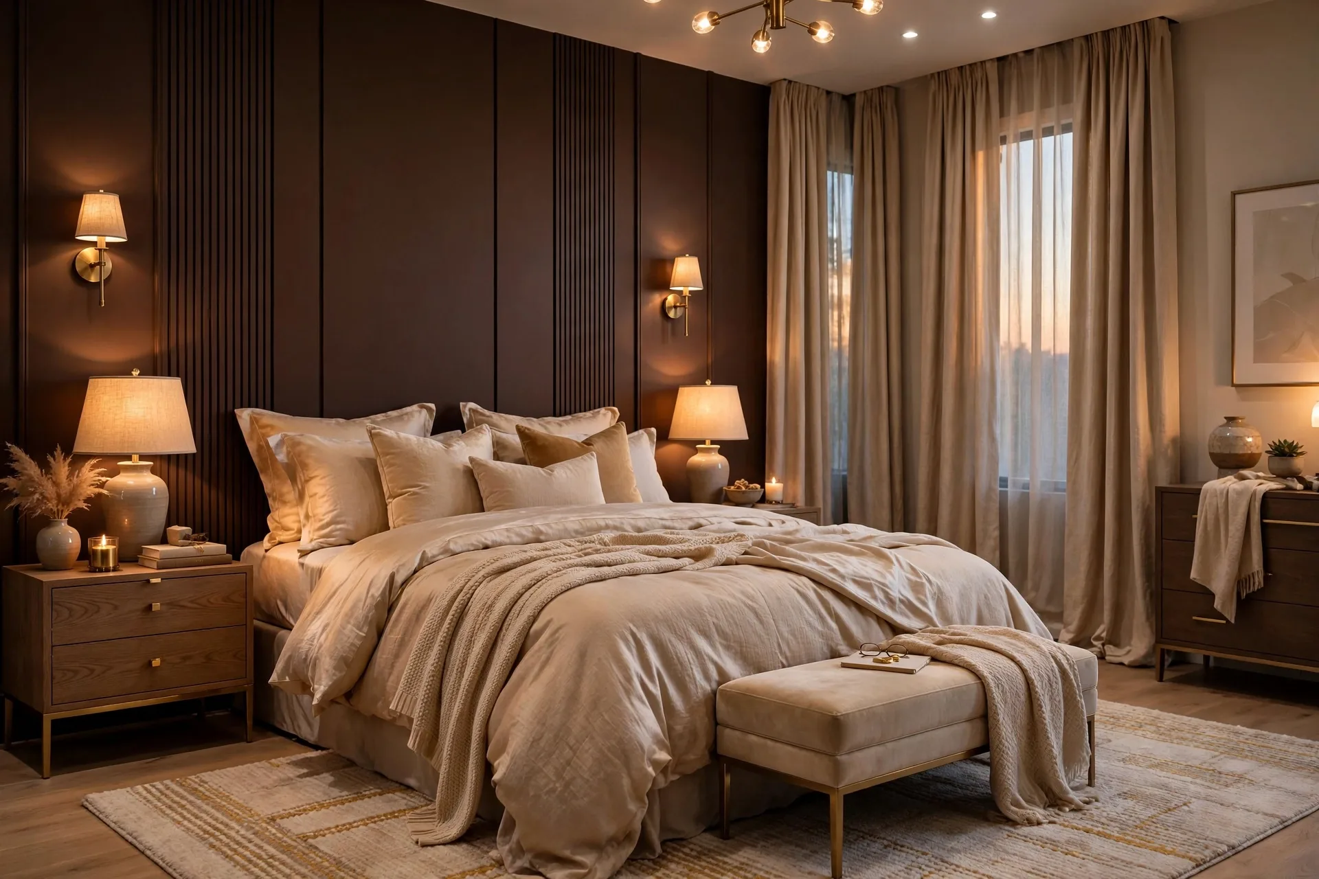
17. Chocolate and Champagne Master Suite
For the main bedroom, go rich: deep chocolate brown on an accent wall or in the upholstered headboard, with champagne tones in the bedding, curtains, and lighting. It’s indulgent, cocooning, and deeply restful — like sleeping inside a truffle. Make it work: keep the other walls a soft warm white, add layered lighting (no overhead-only), and choose bedding with a subtle sheen. This is grown-up luxury without the price tag.
Testing Before You Commit
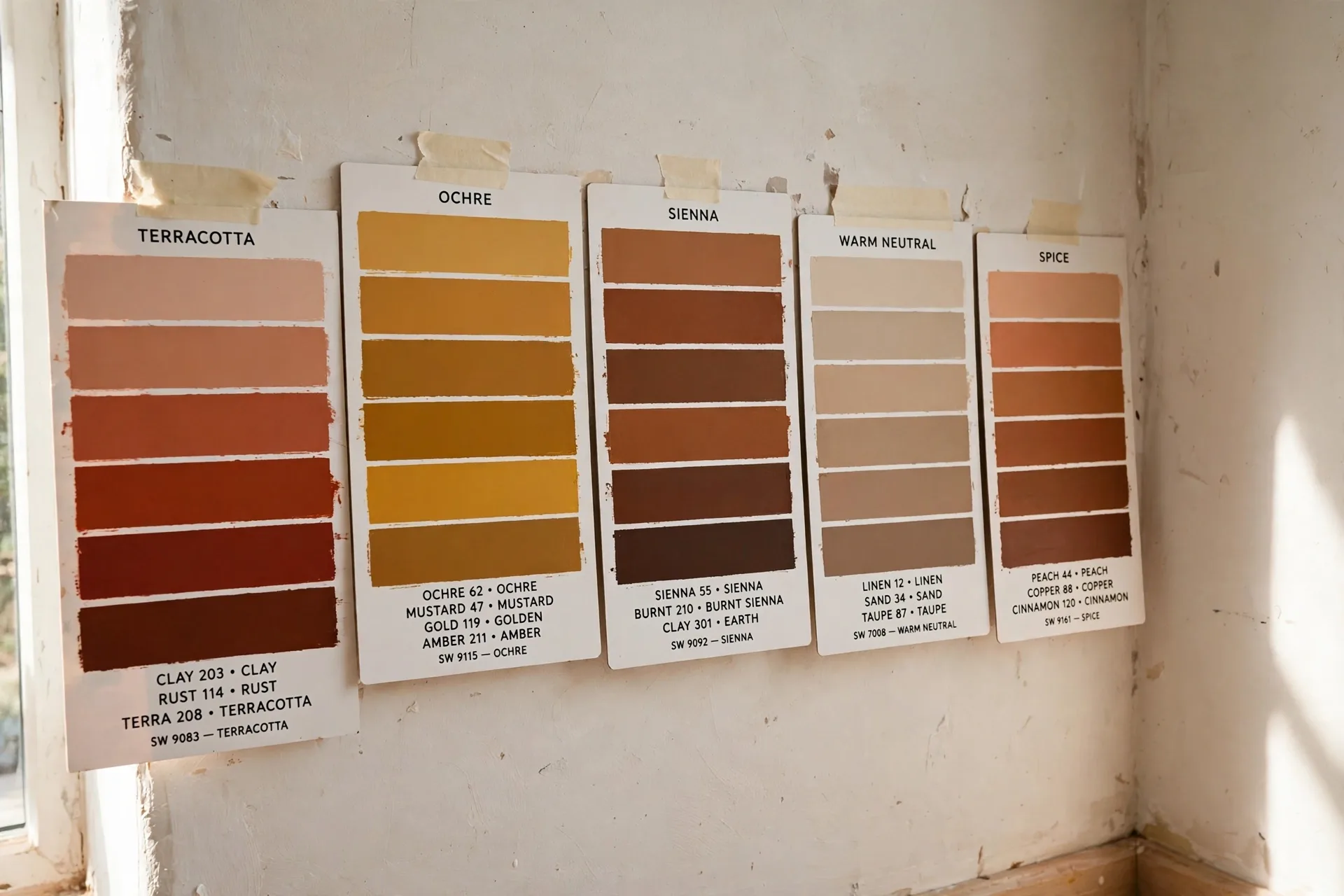
Every scheme above deserves a real-world test. Buy sample pots, paint large poster boards (not directly on the wall), and move them around the room for 48 hours. Check them in morning light, afternoon sun, and under your evening lamps. Colors shift dramatically — and the shift is where the magic or the mistake lives. A $10 sample now saves a $500 repaint later.
Small Changes, Big Transformation
You don’t need to repaint the whole house this weekend. Start with one room — the one you spend the most waking hours in. Live with it for a month. Notice how the color changes your mood at different times of day. Then carry the palette’s logic into the next room. In 2026, the best homes aren’t decorated all at once; they’re built color by color, room by room, until the whole house feels like you.